Global Navigation Update
Making a financial super-app easier to navigate
- Company
- Propel
- Year
- 2024
- Tools
- Figma
- Adobe Illustrator
- Vue
- SCSS
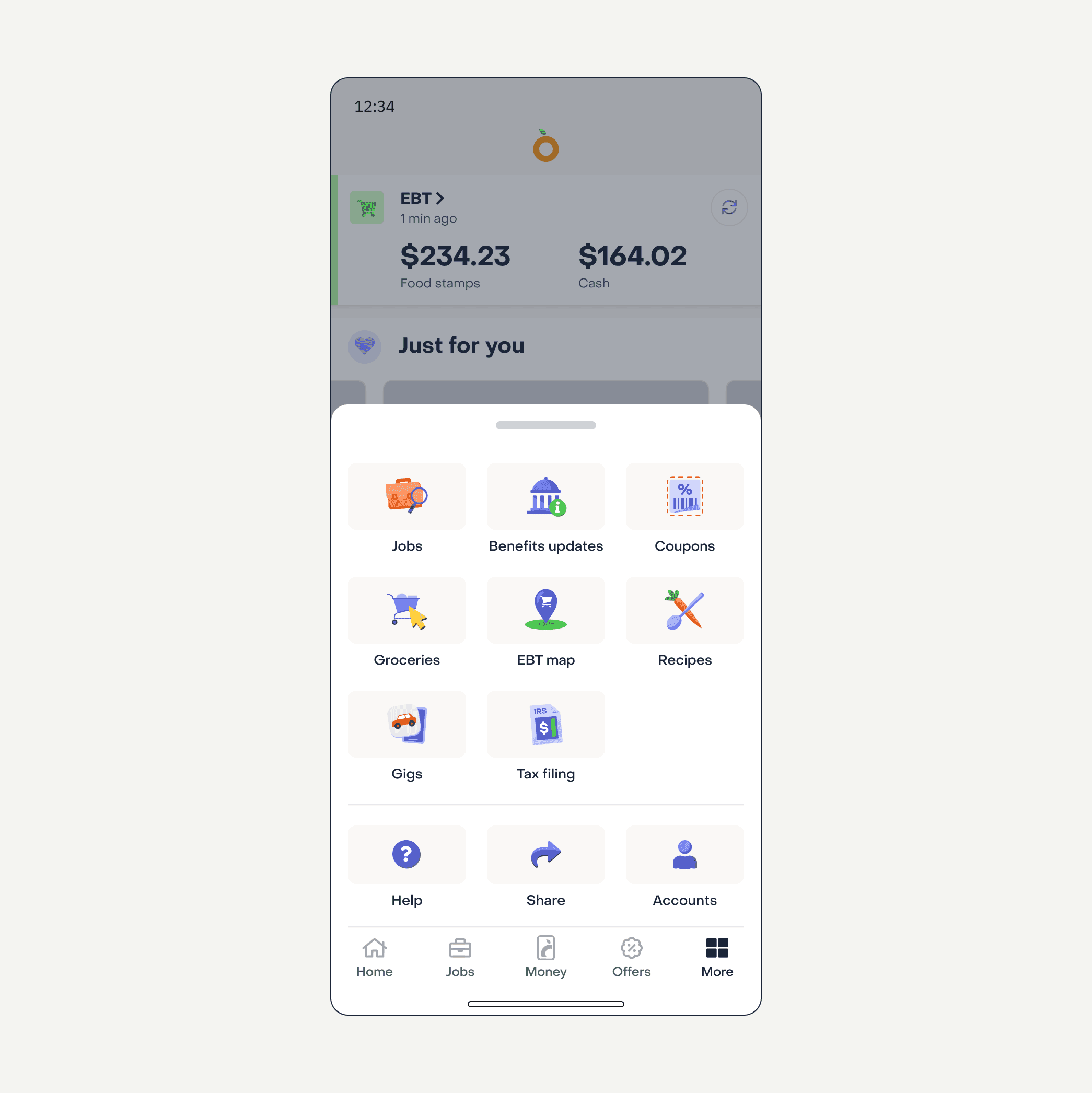
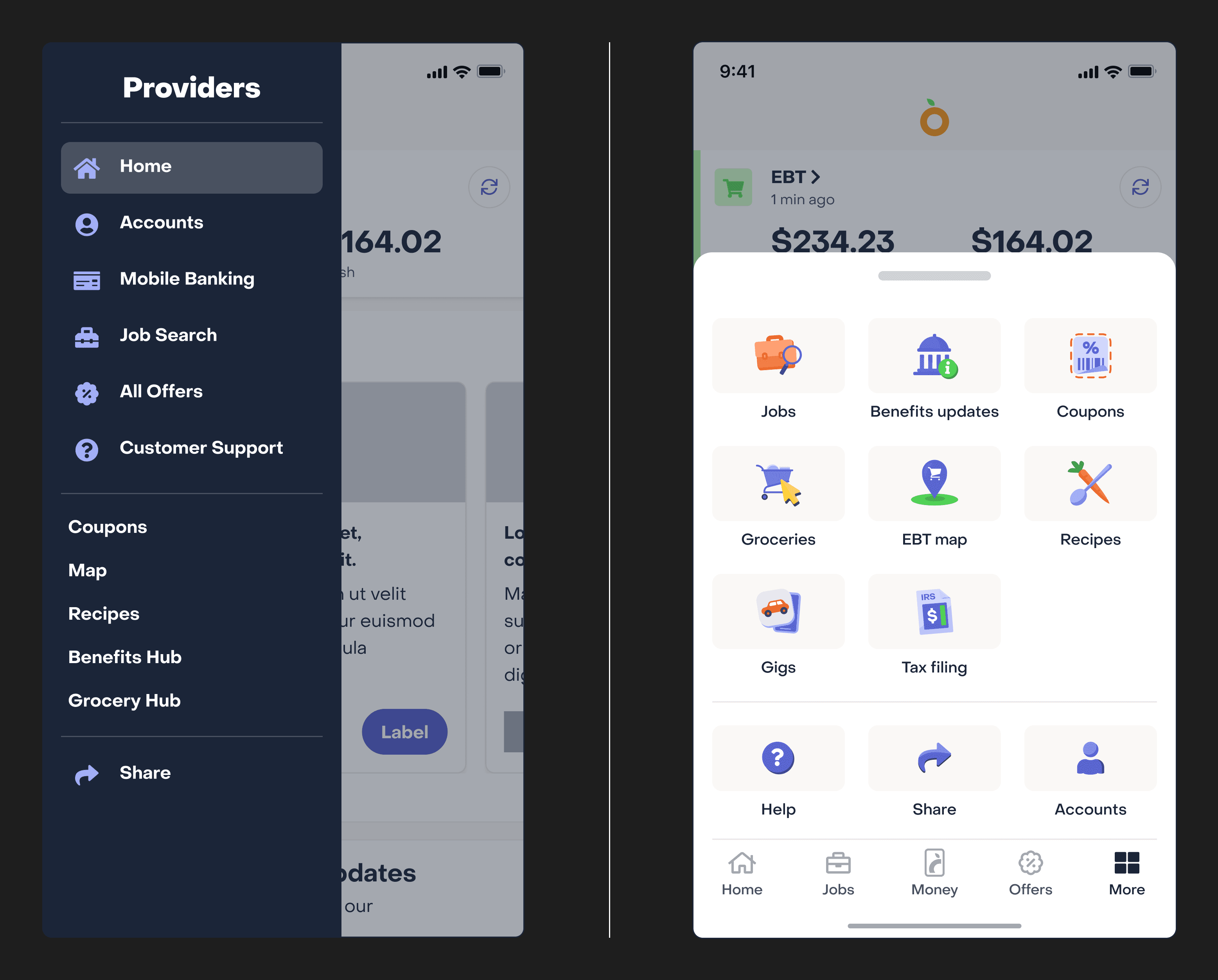
Propel had accumulated a wide range of features over ten years — a jobs board, a debit card, a marketplace of partner offers — but most of it lived behind a sidebar almost nobody opened. My job was to get people using those features, so I moved navigation out of the sidebar entirely and onto tabs that stay visible on screen at all times. It worked: debit card signups went up 40%, and revenue by 5%.
Explorations
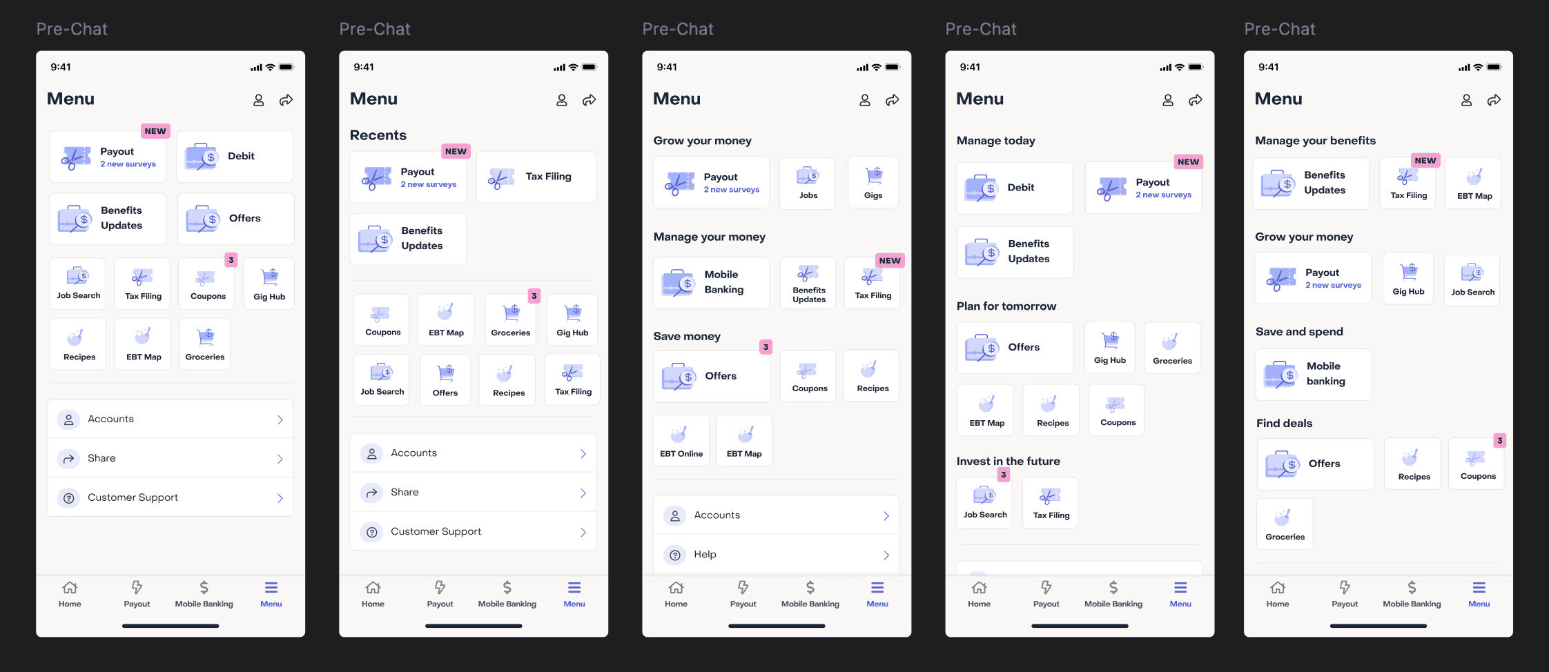
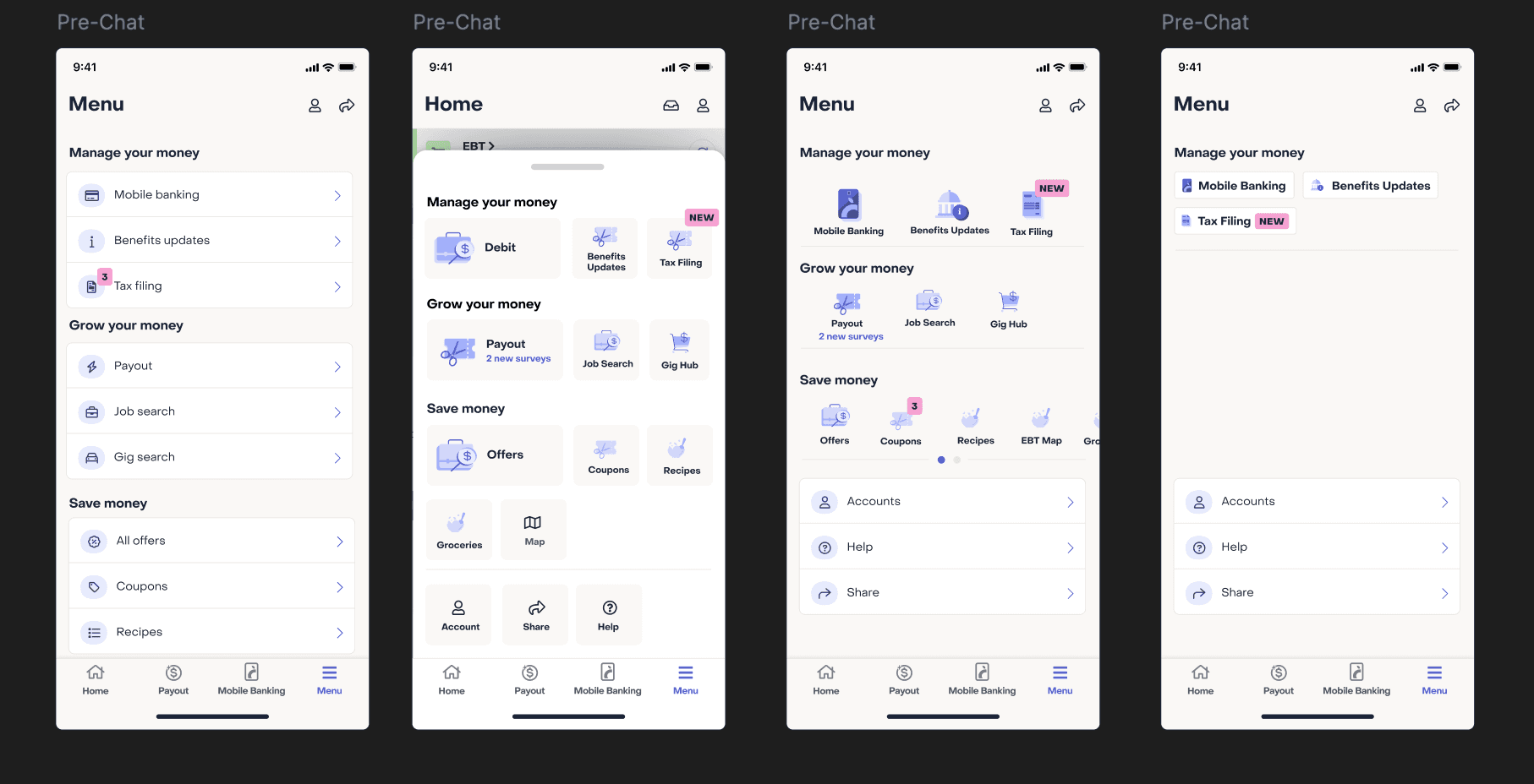
Once the tabs were in place, I still needed a way to show the full breadth of the app's features in a way that invited exploration. I tried pages versus bottom sheets, lists versus grids versus by tags. We landed on a grid — dense enough to show a lot at once and structured enough not to overwhelm.
Iconography
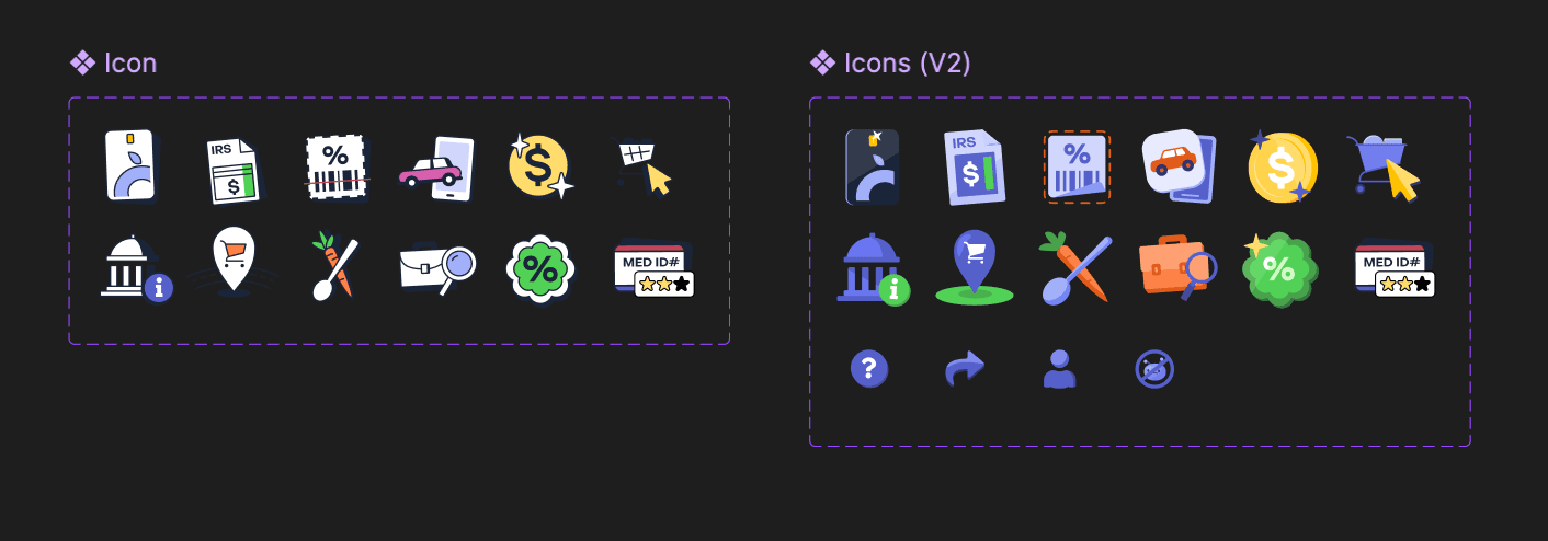
I designed one icon per feature, following Propel's existing illustration guidelines, so the new navigation felt native to the rest of the app.