Home Page Redesign
Adding clarity and efficiency to Propel's most-trafficked page
- Company
- Propel
- Tools
- Figma
- Vue
- SCSS
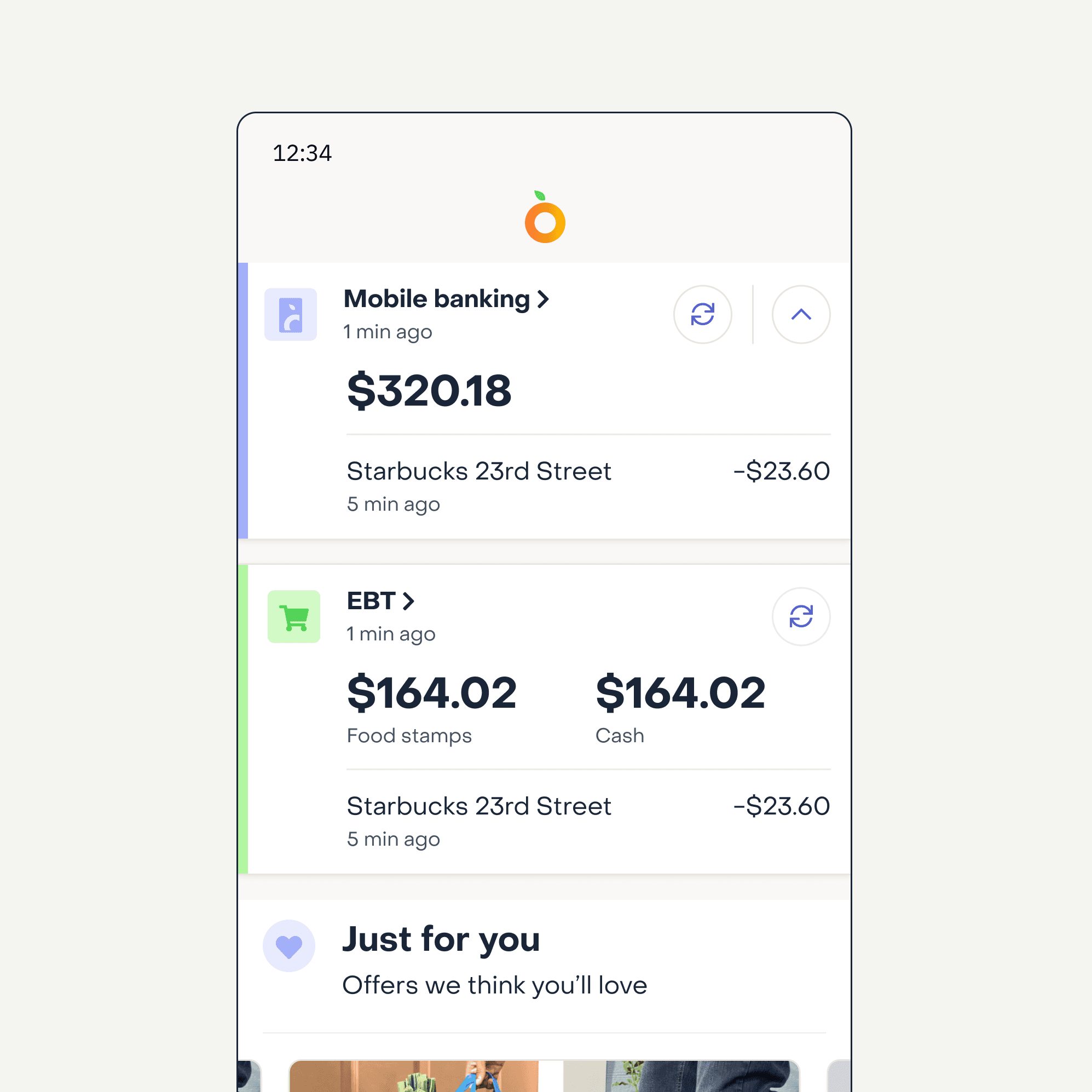
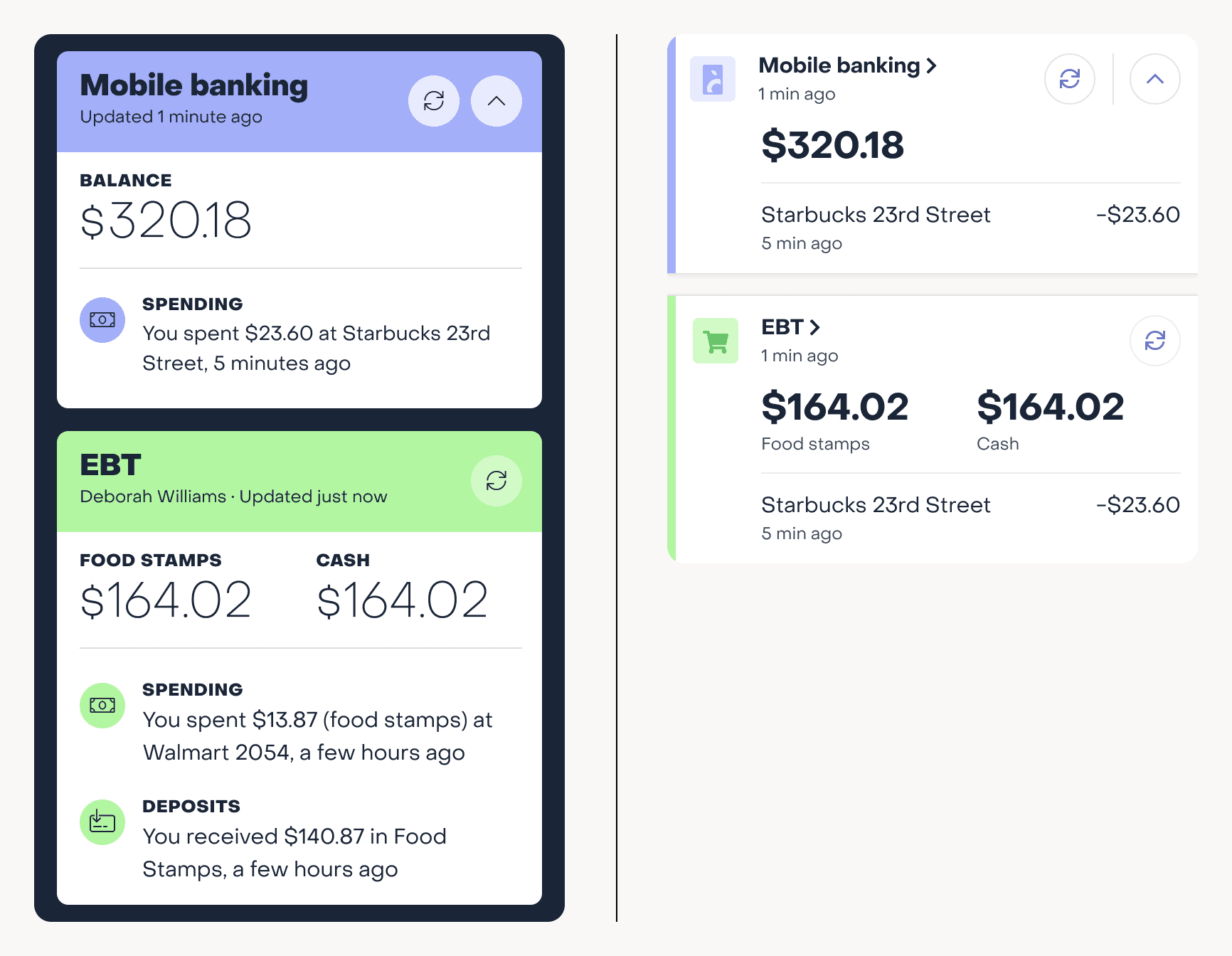
Propel's home page had two problems: ads were buried below the fold, and there was no clear hierarchy to the information — everything competed for attention at once. I revised the color and typography so what showed up first mapped to what actually mattered to the user, and rethought what information appeared when, since there was never room to show everything at once. Revenue went up 12%.
Challenges
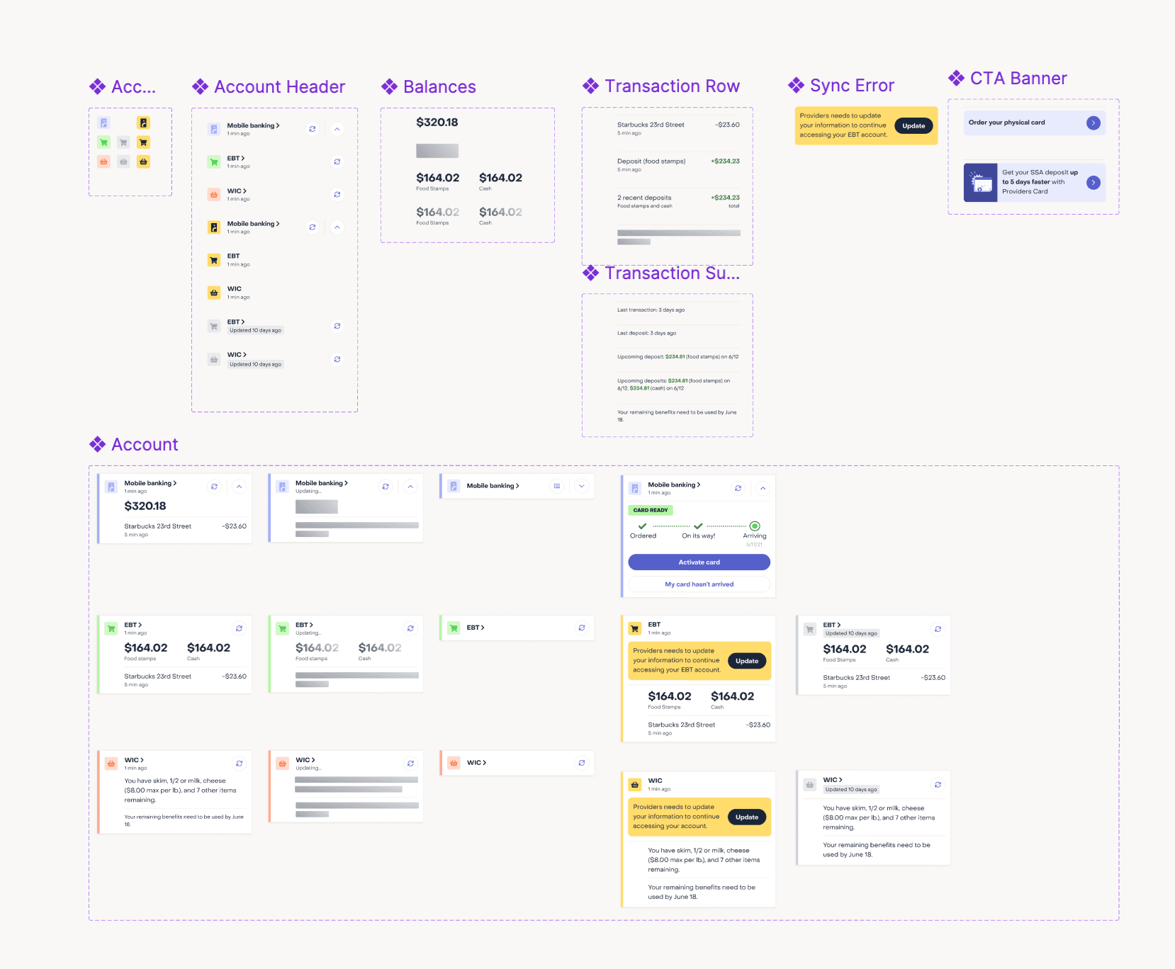
The home page pulls from more financial data sources than any other part of the app, which meant accounting for a complex set of states. I read through the codebase myself and mapped out every possible state, then built a Figma file that let every stakeholder see the whole system at once instead of just the happy path.
Explorations
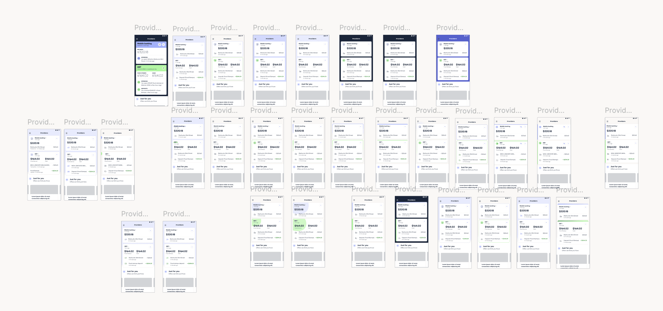
I went through dozens of layouts, and just as many ways of using color, before culling down to a handful of real candidates.